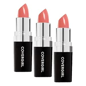
Continuous Color Lipstick
Continuous Color is a research direction for someone who wants a conventional cream-style lipstick and direct reapplication. The family should still be approached shade by shade, because a pearl or frosted surface changes the intended effect. Its useful role is a familiar tool and color format, not a promise that every shade gives the same finish.
- Formula family
- satin
- Described finish
- Cream
- Evidence
- Documented product research
Fragrant lips editorial · Research-based interpretation · No hands-on score
A routine it could suit.
Consider it for an everyday lip refreshed directly from the bullet after a meal. A current shade image showing the product without extra gloss is more useful than a generic family image when choosing the surface.
- Cream finish
- Traditional application
When to reconsider.
A finish-specific matte or satin range may be easier if you want a very clear visual target. Do not choose a shade expecting a simple cream look when the only reference available suggests shimmer or frost.
Some shades have a frosted or pearl appearance; check a shade-specific image before deciding on the finish.
What sets it apart.
COVERGIRL lists Continuous Color as a traditional lipstick family alongside the separate Ultra Matte and Outlast products. The existing shade references include cream-style and more reflective appearances, so the exact finish should be checked instead of inferred from the family name.
- The official COVERGIRL collection lists Continuous Color Lipstick.
- The exact shade’s surface requires its own reference.
Find a shade direction.
Separate shade suitability from the possibility of pearl or frosted reflection. On any complexion depth, a reflective shade can read differently from an otherwise similar cream. Decide whether that surface is part of your goal before narrowing the color family.
| Reference | Color families to compare |
|---|---|
| Light | Compare a muted rose, peach-rose or light-brown reference for a quieter look. A deeper red or berry creates a more deliberate contrast. |
| Medium | Compare rose-brown, warm pink-brown or terracotta references at a similar depth before changing undertone. Increase depth or brightness when contrast is the goal. |
| Tan | Compare caramel-brown, rich rose or terracotta references with your own lips. Check whether lighter shades become a deliberate contrast or look different from your intended effect. |
| Deep | Compare cocoa, plum-brown or rich rose-brown references for a closer-depth look. Bright or light shades can also be deliberate choices; their coverage needs to be visible in a real example. |
These are optional color-family starting points, not verified matches to this product’s shades. Skin depth does not determine undertone, and neither fixes a person’s color preferences. Check the exact shade and its appearance on your natural lip color.
Lip shapes & goals to try.
COVERGIRL Continuous Color Lipstick can be explored on any lip shape. The examples below connect its satin format with optional application goals. They do not rank shapes or predict a wear result.
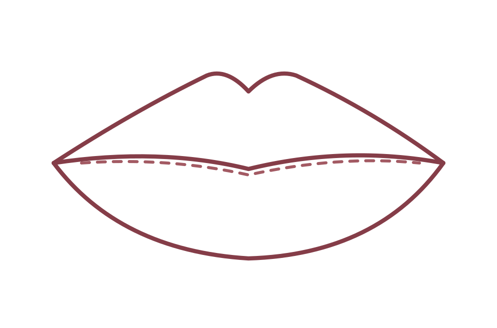 Full lips
Follow a naturally full outline
Apply inside the existing border, then decide whether a precise or softly blended edge suits your goal.
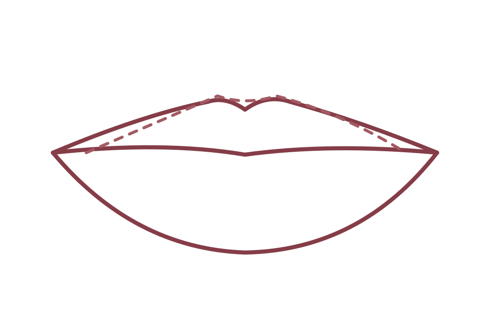 Fuller lower lip
Try optional upper-lip definition
A close-tone liner can emphasize the upper edge while leaving the lower edge softer.
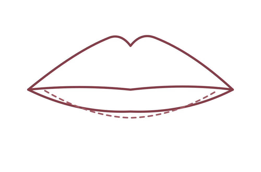 Fuller upper lip
Let proportions lead
Follow the upper contour and compare a slightly lighter central lower-lip application if you want a different emphasis.
A useful comparison.
Questions before choosing.
- Is the chosen shade described or pictured as cream, pearl or frost?
- Do you want direct bullet refreshing?
- Is the comparison based on a specific shade rather than a family photograph?
Read the context.
Matte, satin or sheer? Start with the finish. ↗
Color gets the attention. The finish often decides whether a lipstick belongs in your everyday bag.
GuideBuild a three-lipstick wardrobe you will actually use. ↗
One familiar shade, one deliberate statement and one experiment can teach you more than a crowded drawer.
GuideUse undertones as a clue, not a rule. ↗
A practical color comparison for people who have never felt at home in a rigid warm-or-cool category.
Evidence & limits.
The product image was supplied by the site owner. Any pictured swatches are part of that supplied image, not an independently documented Fragrant lips wear test. Pictured shade labels and regional packaging do not establish an independent shade match or the appearance of every current US version.
Manufacturer references: COVERGIRL — official product information. Original addresses and research notes are retained in the editorial archive. This page combines documented product features with editorial interpretation.
Shade-specific application feel, transfer, wear and removal have not been independently observed. The pictured color does not establish a shade match.
See the research notebook, our editorial standards and the blank wear-test worksheet. For corrections, contact Fretcy.